 Like Us!


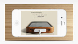 Have you ever seen some websites that show a gorgeous slideshow that’s embedded in a screen of an iPhone, iPad, television or just some latest cool gadget?
When we look at them, they really catch our attention. Let’s face it, when you see a large iPhone on a website that’s playing something, you’ll probably look at it out of curiosity – as it does a pretty good job at grabbing your attention.
This is a very effective way to market your products, ideas or creations. Not only that, it makes your website look good and stand out at the same time.
Here’s what you may not know – You can also create this with some basic Weebly elements with our premium templates!
Although it looks difficult and that it may require some sort of special programming, it really just takes minutes to do so and it’s not as hard as you think.
**This tutorial is NOT recommend for Full Width Header Themes (like Deja Vu, Habitu, Paperclip and etc) OR Responsive Themes (like Drops, Sabbatical, Quiver)!!!
You’ll be able to impress your visitors, and make your website look heavily customized by a designer. It works really well.
You can download some sample image files and follow our video tutorial below to build the Framed Slider on your own.
**COMMONLY ASKED QUESTIONS:
Q: I’m unable to lock the background image of the device using a width header theme like Deja Vu, Habitu, Paperclip and etc?
A: That tutorial works best with regular header themes that have a fixed header image size. Full width responsive header themes like Deja Vu, Habitu, Paperclip, and etc, adjust the header image size to match your monitor size. So depending on your monitor size, the header re-size to fit different device sizes. Because of the responsive feature, the background moves while your content remain relatively the same. This make creating the frame more difficult with responsive header, but it still can be done.
The height of the DD header remain the same no matter what size monitor you use. To keep the header image resizing to a minimum, use a large monitor to upload your header image. Weebly automatically crop your image to the size of your monitor. So the larger the monitor, the wider the image you can upload. The best monitor resolution is 1920px or higher. Alternatively you can zoom out of your browser to before uploading the header image. It will also allow you to upload a wider image. Once the image is uploaded, you can zoom back to default size.
Even with this tip, there will be a slight background size difference from editor mode and publish mode. In editor, there is a tool bar on the left. When the site is published, that tool bar will no longer be there. This allow the viewport to be wider and thus the header image will adjust to the change in viewport width. So you will need to make small adjustment back and forth to center your slideshow like in our tutorial.


