 Like Us!


Customization Guide – Icon Types

The Icon Type Image Widget has 3 customizable areas:
- Hyperlink your image to a webpage
- Add/Change image
- Change hovering background color
Hyperlink Your Image
The link of your image is indicated by this code:
<a href=”YOUR URL“>
Insert any URL in place of “YOUR URL” (for example, http://www.google.com).
When inserting the URL link, make sure it is within the two quotation marks. If the quotation marks are erased, the Image widget will not function properly. In case the quotation marks are accidentally deleted, simply add them back in.
Default Code
Add/Change Image
Step 1: Upload Image
(a) Open your W Theme Editor, click on “Design” and then on “Edit HTML/CSS” tab towards the top right corner. (b) Find “Add new file(s)” on the left vertical column. Here is where you will upload your images
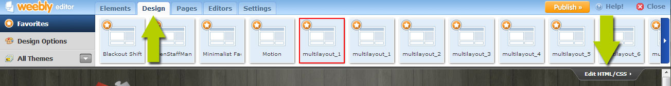 a) Access W Theme Editor
 b) “Add new file(s)”
Step 2: Retrieve Image URL
b) Right click on the image and select “Copy Image URL”.
c) Here you can paste it on a Notepad/Wordpad/TextEdit (to reference back to these image URL’s later). Proceed to Step 3.
 a) & b) Copy image url
Step 3: Insert Image URL
Look for this code:
<img src=”IMAGE URL” alt=”#” />
Paste the copied Image URL in place of “IMAGE URL” (for example, http://www.google.com). When inserting the URL link, make sure it is within the two quotation marks. If the quotation marks are erased, the Image widget will not function properly. In case the quotation marks are accidentally deleted, simply add them back in.
Default Code
Choose Your Background Color
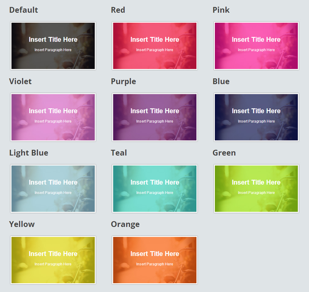
The Image Widget comes in 10 different colors, in addition to the default dark hover background. You can review the color choices in the demo site by click on the button below (scroll to Section “3) Background Color”):
A tip is to keep the demo site page open so you can refer back to the color choices whenever you need to.
Changing the background color is as simple as adding a color text. The code we will be working with is this:
<i class=”article”></i>
Depending on the icon style you choose, instead of “article”, you might see “video” or “image” or “info”. As default, there is currently no color name, so the widget will use the dark default background.
Default Code
You can choose to use one of the following background color:
Pink, Red, Violet, Purple, Blue, Light Blue, Teal, Green, Yellow and Orange
In this example, we will be adding a pink background by inserting the word “pink” in small cap:
<i class=”pink article”></i>
If we want to change that to green, we simply replace the word “pink” with “green”.
<i class=”green article”></i>
If we want to change it back to default, simply remove the color text and it will set back to the dark default background.
<i class=”article”></i>
The same customization steps / concept applies to the other Icon Styles (“Video” or “Image” or “Info”).
Save Changes and Publish to see the Image Widget Live.

- Pink Background Example
For more details on how to customize the size, style and color of the fonts in the Image Widget, Click Here